André Agius + Co. - Company and personal branding
Client
André Agius
Category
Branding
Logo design
Social media
Project Summary
This project presented a unique challenge. André is a director and theatre-maker based in Edinburgh and Malta, and is about to found his own theatre company. I was approached to help create a brand for both André’s personal identity, which is prominent on social media, and for André Agius & Co., the creative endeavour launching the new theatre company.
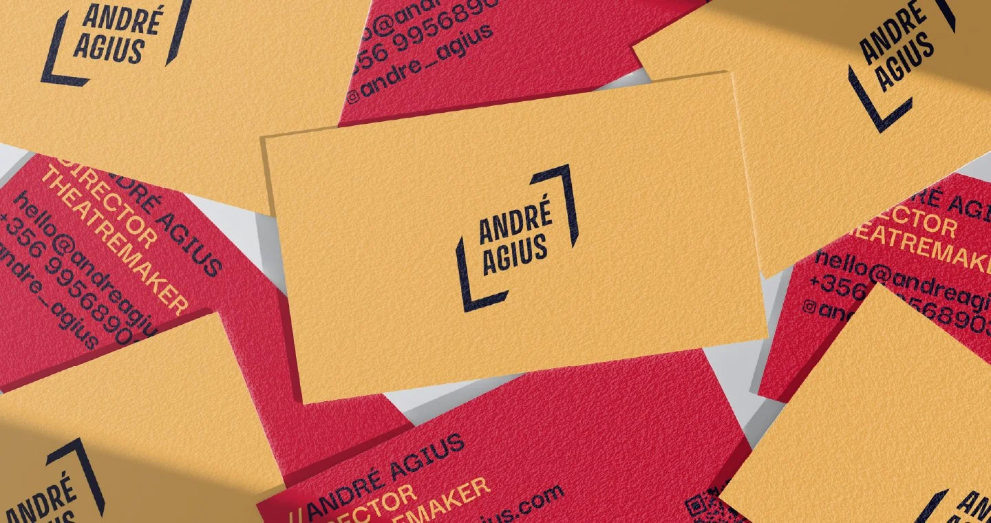
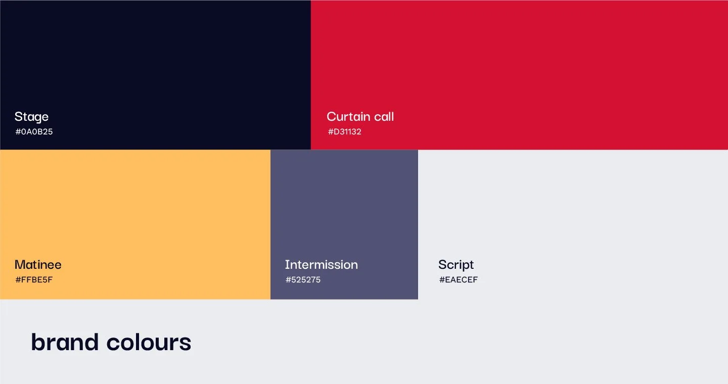
These two sister brands share core elements—brand colours and typography—creating a symbiotic relationship where recognition and work feed off each other. The shared elements bring cohesion to the universal André Agius brand, while each brand retains unique quirks for individuality. Their distinct interpretations of these elements help them stand out.
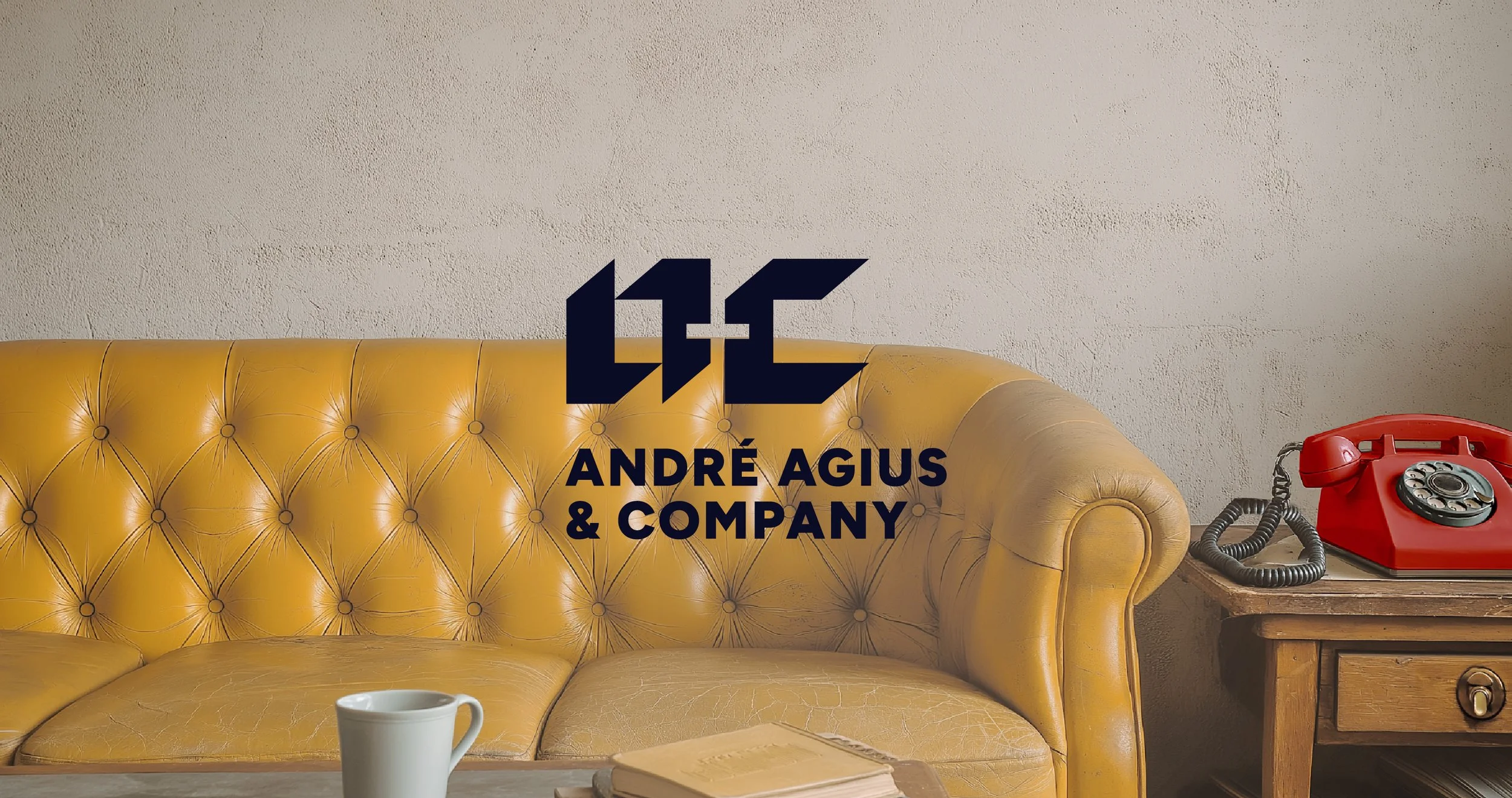
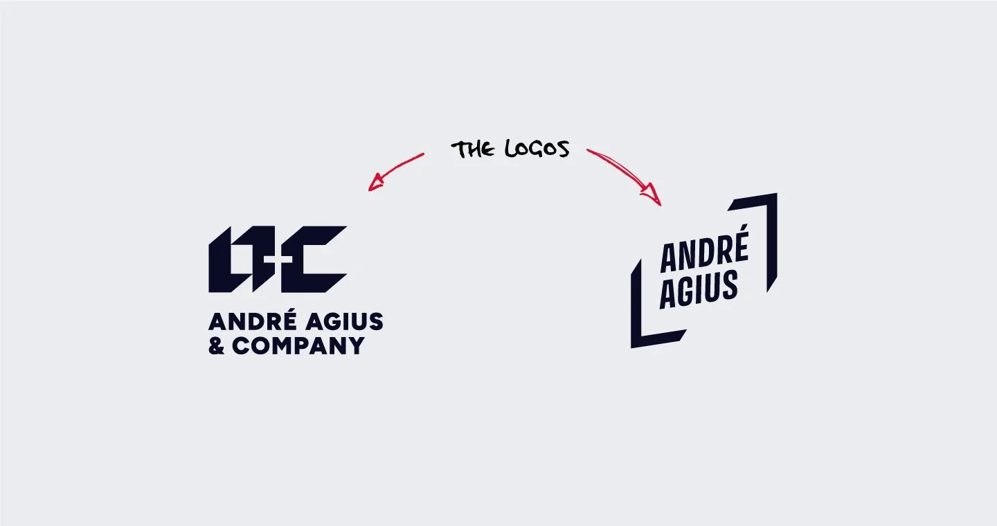
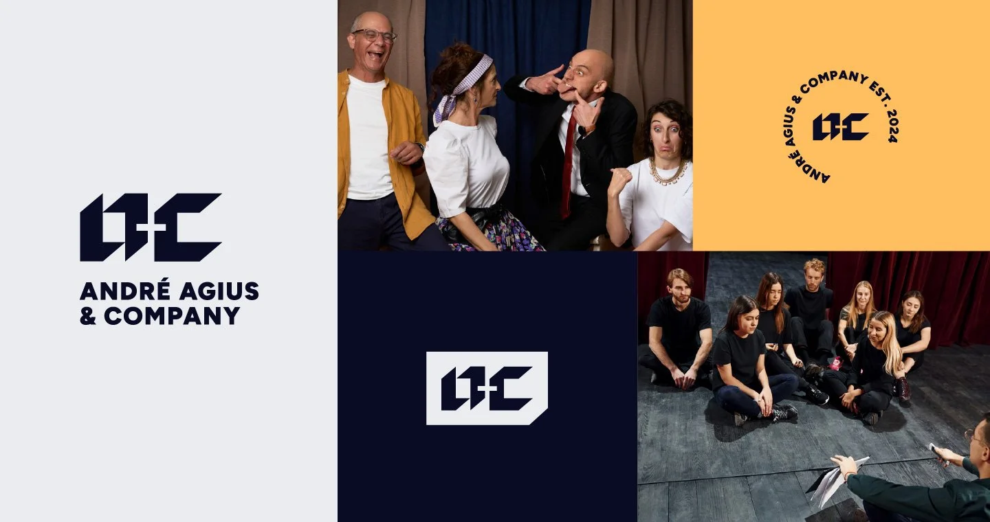
The plan was to create a bold, minimal, and modernist brand reflecting contemporary theatre culture, infused with André’s personality for distinction. We began by developing the company’s branding. The André Agius & Co. logo is sharp and angular, evoking modernity and innovation, chosen to reflect the company’s fresh, bold approach to the local theatre industry. The logomark subtly references contemporary theatrical staging. Basic shapes in the design cleverly utilise negative space, creating a simple yet edgy typographic and 3-dimensional effect. The logotype is a geometric sans serif, easily legible and complementing the “a+c” icon.
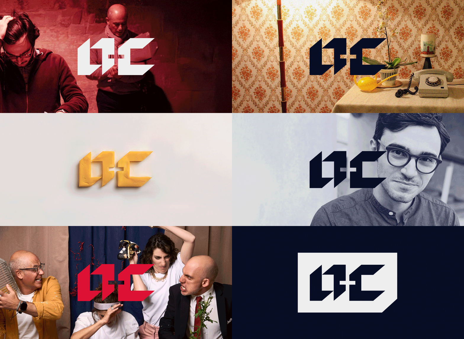
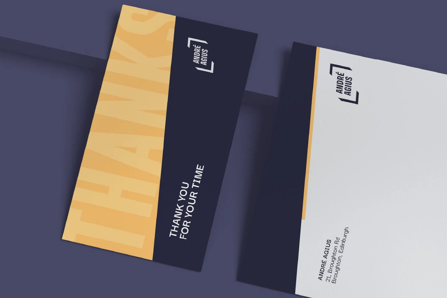
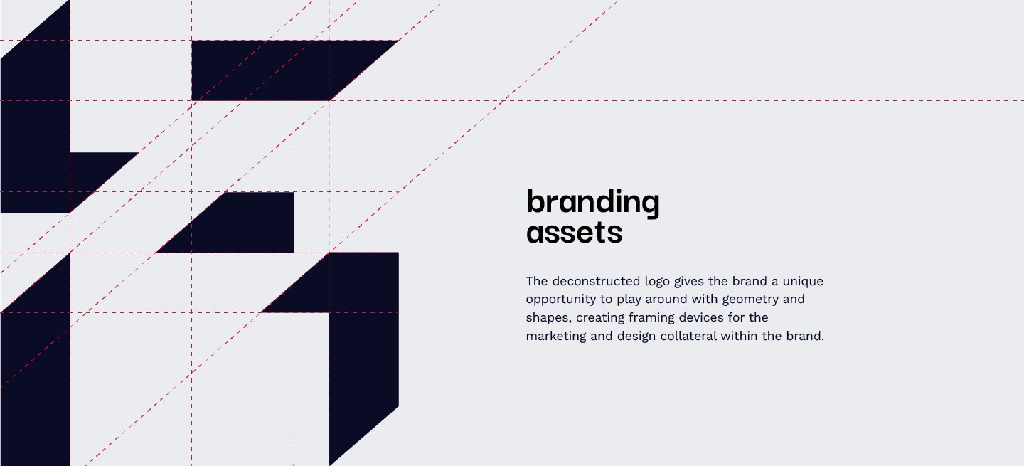
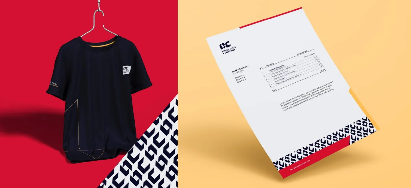
The geometry of the logo provides a unique opportunity for adaptation across the brand. These shapes serve as ideal framing devices for the company’s marketing materials and theatre production promos, subtle brand marks that do not clash with the unique design of each production.
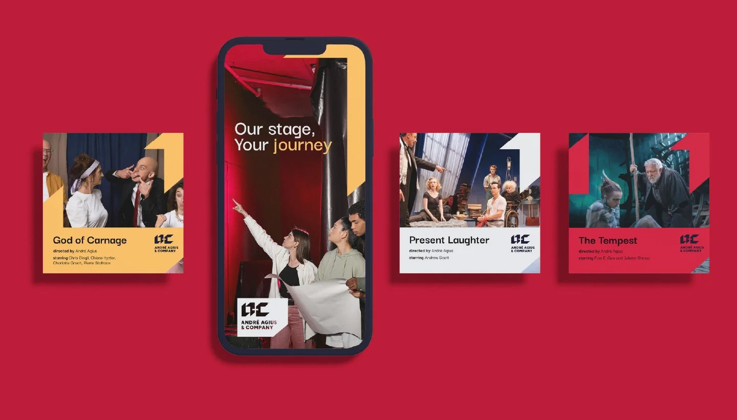
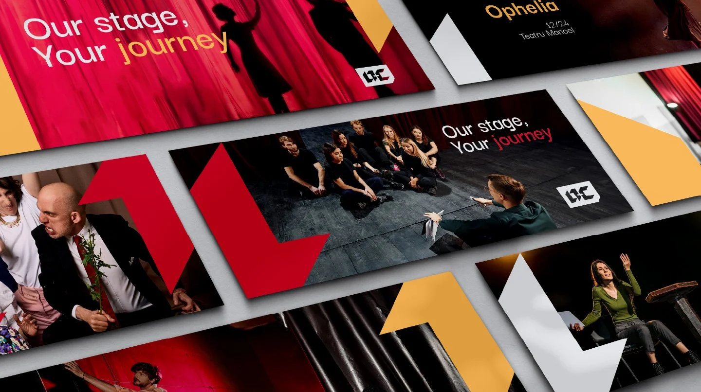
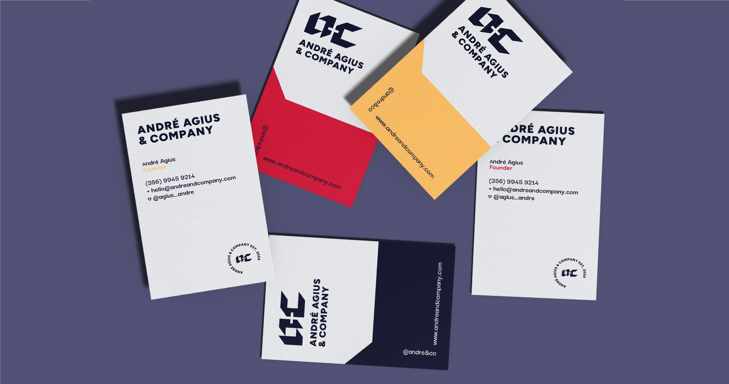
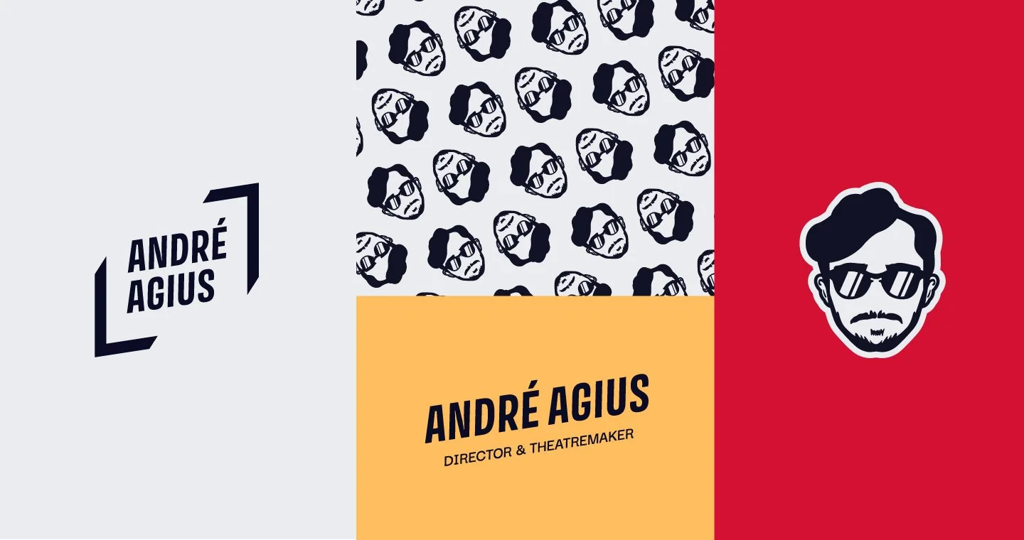
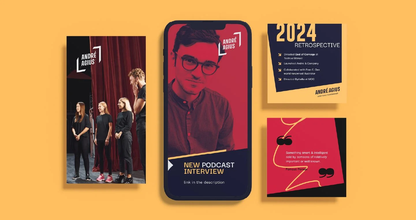
André Agius, as a director and theatre-maker, has already built a strong following and reputation in the industry. His logo and brand extend his personality, featuring a framing device that visually connects to the André Agius & Co. brand and provides a sense of structure and professionalism. The result is a punchy, iconic logo created with a bold, sans-serif typeface. Straight lines and angles—drawn from stage framing—enforce the theatrical theme shared by both logos. The frame suggests structure and focus, reflecting André’s reputation.
To complement the branding, playful and quirky graphic elements were developed for use across marketing materials and social media. These include a graphic representation of André himself, further strengthening the brand’s overall visual suite.